
Rebranding or reblanding? Car logos are trading character for cleanliness
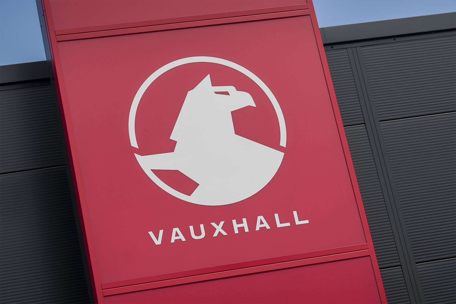
Vauxhall and McLaren are the latest to adopt bold, simple new emblems – but where’s the individuality?

So the Griffin has become the latest prey of simplification syndrome, with the Vauxhall logo one of many that have in recent years been made increasingly basic and two-dimensional.
One aspect of the new look feels deliberate: the griffin has laid down her flag (‘her’ because in heraldry female griffins typically had eagle’s wings, like Vauxhall’s logo usually does, whereas males had spikes).
It’s the first time in 111 years she hasn’t held one aloft.

Could be a coincidence, could be because flag-waving apparently isn’t perceived as quite such a done thing as it used to be and the griffin is evidently not one to be seen climbing a lamppost.
Seems a pity if it is culture war-related, but I imagine it will be back one day.
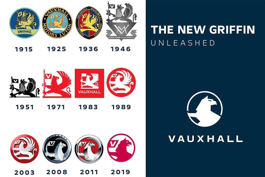
The second aspect of the redesign is less of a lifestyle choice and more of a modern necessity.
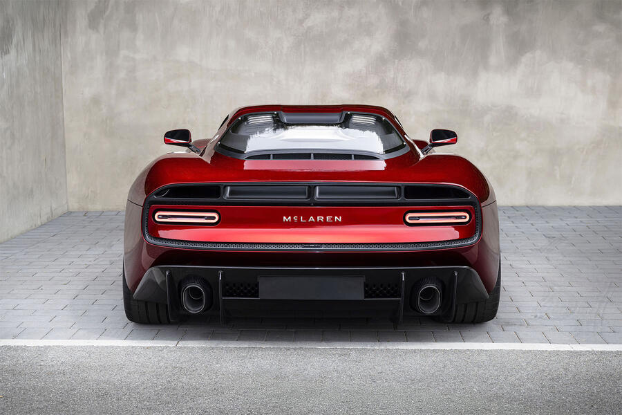
See also McLaren’s recent redoing, the flattenings of Lotus (2019), Volkswagen (2019), Citroën (2023), and many more besides. Reblandings rather than rebrandings.
It’s hard to hold designers to account for this. At least it’s hard to hold company logo designers responsible.
Less so, perhaps, the hardware and software creators whose myriad technologies, despite their vast cost and complexity, have apparently limited ability to show complicated three-dimensional logos at different scales.
It’s this which is largely behind so many logo redesigns of late.
Tricky or three-dimensional designs are out and simpler, more scalable, more easily presented monochrome styles, which must look the same on a poster or at a mere 120×120 pixels, are in.
Bit of a shame, this, I think. Curiously, in most aspects of life, as things evolve they tend to get more complicated.
All life on earth can trace its lineage back to single-cell organisms from billions of years ago.
Logos, seemingly not so much. They’re now so often monochromatic, flat and simple-all driven not by the need for distinctiveness and certainly not to be more beautiful but to satisfy the demands of accurate replication, at any size, in any medium, without distortion, from a small screen to a big one, from being moulded into plastic to printed on a cap.
As a result, though, shorn of effects, colours, shading, shadow and reflection, they’re starting to lose their individuality.
Sure, even in a small pixel icon there are lots of colours to choose from and lots of places to put them.
But there’s also an almost limitless number of QR code variations, and can you tell those apart?

Related posts





Latest Post




No Comments